Window and door colours: warm tones, anthracite and natural palettes
From RAL to bicolour inside/outside: how colour choices define a project's architectural identity.
June 13, 2026 / 4 min read
From RAL to bicolour inside/outside: how colour choices define a project's architectural identity.
June 13, 2026 / 4 min read
There is a moment in every design process when a window system stops being a technical specification and becomes material. That moment often arrives with the choice of colour — a decision that simultaneously engages the facade, the interior, the quality of light and the overall character of a space. In recent years, this choice has grown more deliberate, more nuanced, and in many ways more demanding.
The trends shaping the industry in 2025 and 2026 reveal two parallel movements: on one hand, anthracite and matte black continuing to anchor the vocabulary of contemporary architecture; on the other, a reemergence of warm tones — earth, sand, taupe, warm brown — that bring depth and humanity back to surfaces. These are not transient fashions, but a sustained orientation towards more tactile, material palettes that sit naturally alongside the natural stone, timber and plaster finishes characteristic of high-quality residential architecture.
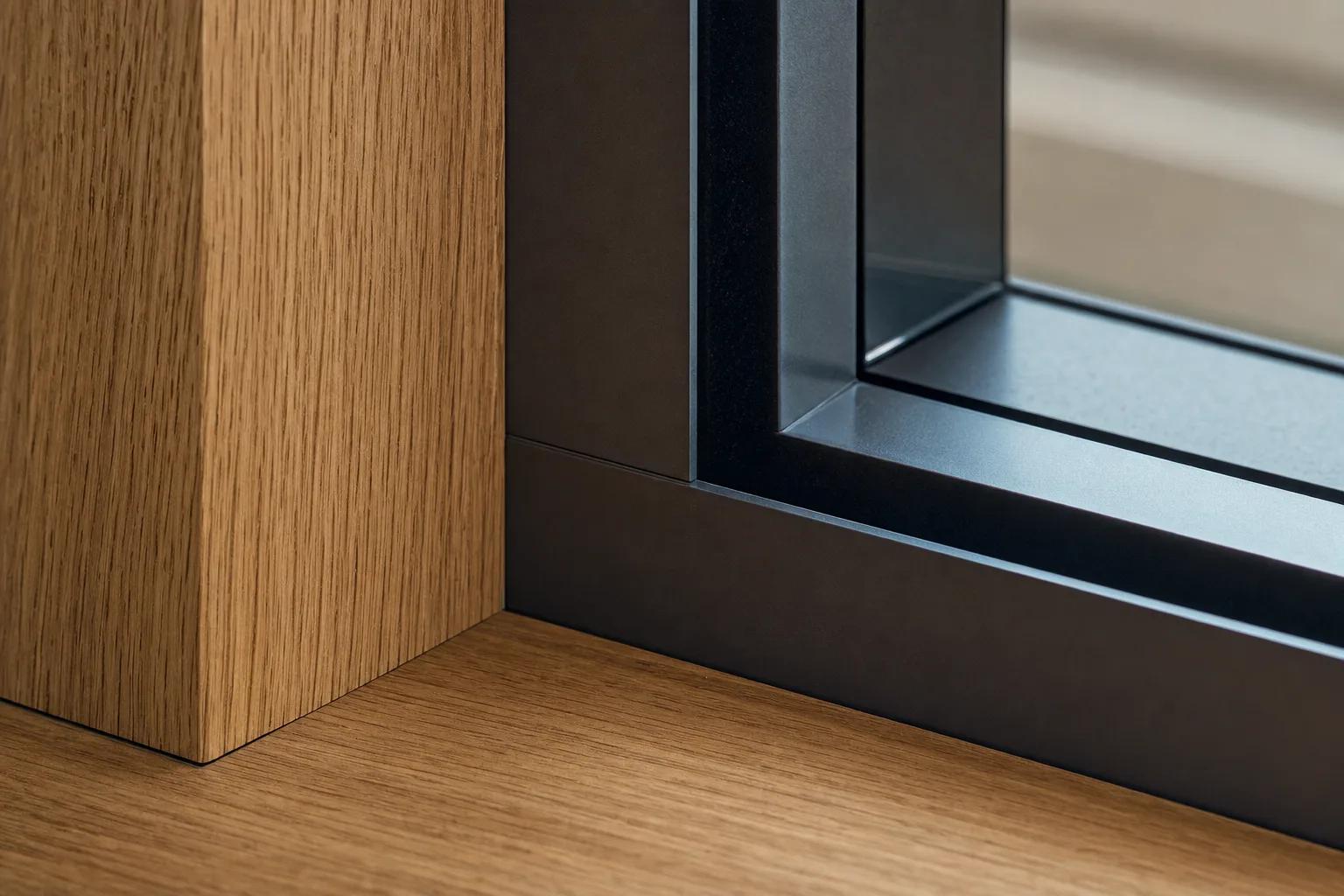
Anthracite remains one of the most requested finishes in the premium segment. Its strength lies in a dual capacity — to recede and to define simultaneously. A dark profile on a pale facade dissolves in raking light, while on stone or exposed concrete it gains weight and presence. Matte black takes this logic one step further, emphasising contrast and the graphic quality of the profile. Both tones perform particularly well in flush glazed configurations, where the frame is reduced to a minimum and colour alone frames the opening.
In the PURASISTEMI range, these tonalities are available on the interior cover — as Rovere Antracite and Larice Antracite — and on the aluminium structure for exterior finishes, with the option to specify any tone from the full RAL palette. Interior and exterior harmony is not a requirement, but when it is intentional, it produces spaces of exceptional formal clarity.
Alongside the greys, tones that evoke clay, aged timber, limestone and warm earth are gaining prominence. These are not quiet colours: applied to slender profiles and full-height panels, they carry a silent but defined presence. RAL tones such as 8019 — a warm grey-brown of considerable elegance — or the quieter neutrals around 9002 express this direction in a versatile, enduring register.
The natural wood cover, available in oak, larch and Canaletto walnut, contributes to this same sensibility. Seen from the interior, a Rovere Terra or Larice Terra cover transforms the profile into a warm, tactile surface in dialogue with floors, wall finishes and furniture. Choosing natural tones does not mean giving up formal precision — it means enriching that precision with material warmth.
One of the most valued solutions in the high-end residential segment is the bicolour configuration: one colour for the exterior, responding to the facade and its immediate context, and another for the interior, calibrated to the living environment. Available in both lacquered covers and aluminium finishes, this approach allows facade requirements to be met while preserving complete compositional freedom inside.
The available combinations in the range — such as 9005 with 7021, or 9005 with 8019 — offer tested pairings, while full RAL customisation opens possibilities for bespoke solutions tailored to each project's specific conditions. Bicolour is, in this sense, a design instrument rather than an additional option: it restores to the window system its full role as an architectural element in its own right.
Every colour decision interacts with light in a specific way. A dark profile against a white wall creates a precise, geometric drawing that shifts throughout the day as light moves across the facade. A warm RAL tone on a brick or terracotta facade integrates and almost dissolves into the surrounding material. Understanding this interaction is part of the design process: choosing the colour of a window system is, in effect, choosing how light will enter the space and how the facade will read from outside.
In PURASISTEMI, this consideration is built into the system itself. The full range of finishes — from natural wood covers to lacquered panels, from electro-colour aluminium to structured surfaces — is designed to offer coherent responses to different projects, without reducing the choice to a simple catalogue of samples. Exploring the chromatic possibilities of the system is the right starting point for window and door solutions that genuinely belong to the project. Discover the full range of finishes at purasistemi.com.
PURASISTEMI is a Fasal Lab brand
Via delle industrie 8
30020 Eraclea
Venice - Italy
commerciale@purasistemi.comwww.purasistemi.comFollow us:
InstagramFasal Lab srl - IT 04725180279
Website Design: Factory42 - Development: MOBA Digital Studio